
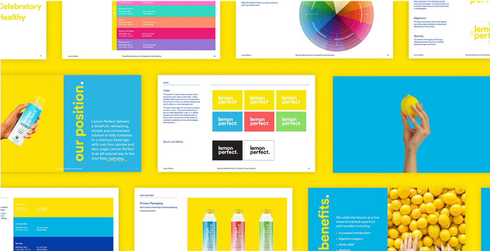
Frank Collective – the branding agency behind Blue Apron, Barefoot Wine, Ladder, Lola,Bombas, and Lemon Perfect – has rebranded to reflect the ways it has matured since its founding in 2011. The agency’s now-former branding is loud, while Frank Collective’s true nature is about radically honest, frank collaborations that are not only the agency’s namesake but its core philosophy. We sit down with Frank Collective founders Jiffy Iuen and Mike Wasilewski to talk about their rebranding experience.
Q: Tell us a bit about how Frank Collective got started and how the agency has grown.
Jiffy: When we started it was just Mike, our then-intern-now-MD JJ, and myself. We rented a teeny-tiny office in a shared workspace. It was approximately the same size of a small walk-in closet.
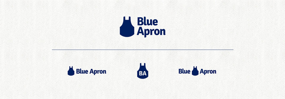
Our aspiration then was to work as a small team that could make big creative. In our first two years, we were able to do some pretty cool projects at that size. We created the Blue Apron brand, shot an editorial video for Mini Cooper and created a guerrilla marketing campaign and event for the Beck’s Green Box project.
We didn’t have any aspirations of ever growing beyond 15 people. It’s crazy to think we’re approximately 50 now. Our rule of thumb regarding growth is if we can’t maintain the integrity of our standards or exceed it, we need to hold fast. We’re not interested in growing for the sake of growing. That being said, we love that we have grown into a full-service agency. It’s been very rewarding to help our clients with not only branding and content needs, but also strategy, business design, web development and marketing.
Mike: Our growth has been pretty steady and, while we may not be one of the more famous names in the industry, it is really great when people know of you and respect your work. It’s funny what moments become your markers of success, you’d think it would be something like annual revenue, cool offices, or awards— but mine were very different. Like when my family stopped asking if, “Everything was ok?” Or when I got the opportunity to lecture at my alma mater, presenting on Frank Collective, and some old friends came to see it. I recently participated in a career day at Parsons and we had a line of eager students wanting to meet with us. That’s a level of appreciation that no award or bottom line can give you.
Q: What was the catalyst for rebranding Frank Collective?
Jiffy: When we started, we thought one of the chief differentiators we could bring to the market was transparency and radical candor. As a result, we leaned really heavily into our “frankness” and became commonly known as Frank. But as we grew, we wanted to highlight our team as well. We have been really fortunate to attract some pretty special talent. It’s their diverse point of view that helps us from becoming too cookie-cutter in our creative. So the rebrand was meant to bring equal weight to both being frank as well as our collective.
From a small three-person shop to a bi-coastal creative agency, we've grown a lot over the last eight years. Our founders, Jiffy and Mike, popped into the studio to introduce a new identity that balances frankness with a collective vision. pic.twitter.com/UaU3skexu2
— Frank Collective (@frankcollective) March 21, 2019
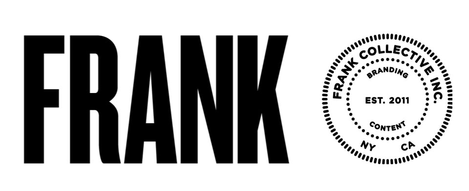
Mike: It was sparked out of a working retreat we did over a long weekend. We put ourselves through our own process and it was amazing what we were able to reveal to ourselves. One thing that really stuck out to me was that for a company that just wants to make great work in the best interest of our clients – we had an identity that was so big, bold, and shout-y – we stole the spotlight. The new identity is the opposite of that and puts our clients and work first.
Q: How is the company’s philosophy expressed in the new design? Which design elements would you like to draw attention to most?
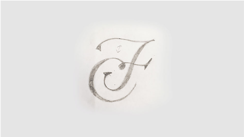
Jiffy: As the non-designer of the bunch, I would say what resonated with me the most was the signature quality of our new mark. It felt human and beautiful. I also liked the new balance of our full name as opposed to our original FRANK logo and seal.
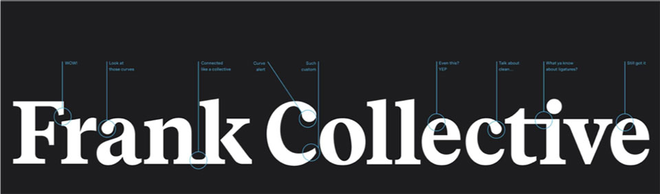
Mike: I love that new monogram too. It’s simple and elegant, just what we needed and nothing extra – which I think is a central pillar of our design thinking here. Another aspect of the identity is that it is very clear. Clarity is so important and oftentimes (ourselves included) creatives don’t know how to get out of their own way when making brand communication.
Q: How does the change represent a shift from a business standpoint as well?
Jiffy: We’ve matured–creatively, as people and as a company. We aren’t just black and white and in your face. We’re still honest and straight-forward, but we’re more thoughtful and diverse. Overall we wanted an identity that you’d associate with a full-service agency. But specifically one that had artistic intentions and a personal approach.
Mike: I would add that this isn’t necessarily reflected in our identity – but the rebrand did allow us as a company to affirm our values both to ourselves and to the wonderful people we work with. I feel closer as a team than ever after doing this process. For a long time it felt like people were working with grandfathered materials – but now this rebrand truly represents a collective vision and investment from our whole team.
Q: How do you think about rebrands overall? How different was the process when it came to rebranding yourselves?
Jiffy: Oh man, it was hard to do it for ourselves. It’s like changing your kid’s name once they hit seven years old. You get really attached to the way your company looks. But then new people joined and you start to look at it with fresh eyes. Our black and white, shout-y FRANK logo didn’t feel like what we had grown into. I think that’s why a lot of companies rebrand. They realize they’ve changed and their old identity isn’t an accurate representation of that. I think rebrands are great if they are purposeful. I wouldn’t recommend changing just for the sake of doing it.
Mike: A key belief of ours is that anything can be awesome – you just gotta dig for that one common thing that is true and with enough creative thinking and exploration, you can make it interesting. I think if you’re setting out with that goal in mind when tackling a rebrand, you will be successful. The thing I like to remind myself, my team, and my students is that branding exists out of a certain necessity. It’s to help your audience find you, identify you, and identify with you. It could be as simple as changing a color or creating a new logo – but it’s bigger than that. We make these changes to solve a problem, to communicate better, to make a meaningful connection, to illicit an emotive response. If you can achieve those, I’d say you had a successful rebrand.
Q: What do you make of the recent trend of agency rebrands?
Jiffy: I think there is a trend of making older agencies look more modern. I can appreciate that as long as it fits. As opposed to watching grandpa walking around in board shorts. Older agencies are rebranding with more trendy marks and I kinda miss the personal, differentiators of the old identities. But I get it. Old wants to be new and young wants to look trustworthy. Just don’t lose your real identity in the process.
Mike: Couldn’t have said it better myself 🙂