
A Q&A with Creative Director Anna Minkkinen
Q: Do you guys think there’s a thread between all the Decades work?
A: Absolutely. When we think about promoting a series, we think of the show as a brand with attributes and values that underpin all creative. Successful shows have multiple seasons, and as we develop campaigns we seek ways to celebrate what makes each season exciting while staying true to the show’s brand. If we were to define the “Decades” brand attributes as a whole, we might say:
- We bring in a modern design aesthetic even as we reference the past.
- We draw inspiration from the intersection of technology and culture.
- We are music driven, re-contextualizing classic tracks in compelling ways.
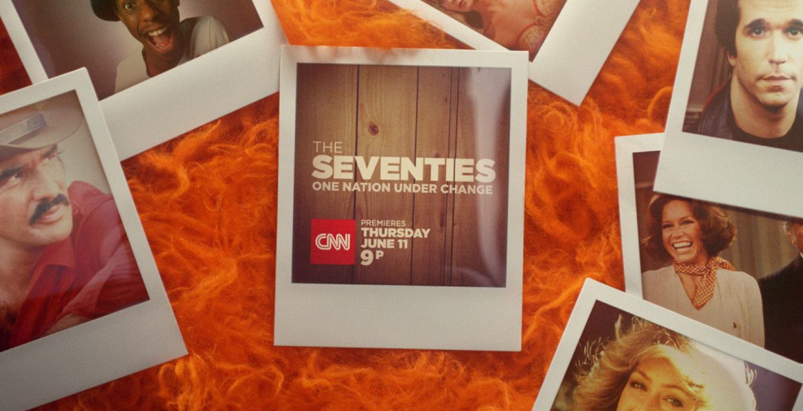
Because we’re promoting a smart documentary series that offers a fresh take on the past, our campaign needs to be thoughtful but also appeal to the viewer as entertainment. This is a CNN Original Series not a CNN daily news program, and we are looking to suggest both an air of intelligence and pop culture savvy. Every campaign begins with research, so it’s important to us to feel like we’ve pinpointed core conceptual themes of the decades. It has been true that each year we’ve ended up involving some kind of technology into our campaign work because technology can be so telling about a given era. However, technology is not necessarily our starting point, and we always look at a variety of ways of visualizing our ideas. Usually the test of any visual angle we’ve taken comes out of a lot of thinking we’ve done about history. For example, when we did our The Seventies campaign, we first had distilled the decade into the line “One nation under change” – because it really described it – it was a decade full of constant upheaval on so many fronts. As we considered what might be a strong visual approach to framing the archival material that would be in the show, Polaroids became the obvious answer. The image, of a Polaroid rapidly developing before your eyes, was the perfect visual representation of sudden change. It was a great framing device for a modern, but still pre-digital era.
Q: Has it evolved in any way, or are there any insights you can talk about relating to how each decade needs its own flavor from a marketing standpoint?
A: This is a documentary series about the past, so we couldn’t control how all the photography was going to look. Each season, we have dealt with a mixed bag of imagery, and it’s always been important to find a way to frame that imagery in some way that allows us to put our own spin on it. We definitely wanted to evoke and harness certain aspects of the aesthetics of each decade as in our shooting style for The Seventies spots, but we generally avoided getting completely lost in each decade typographically or stylistically so as to maintain some overarching brand identity.

For The Sixties, we loved playing with the plethora of old school televisions and using them as framing devices. What was great about the TV theme for The Sixties was that it was not only a great framing device, but thematically it was hugely important as this was the period when the majority of Americans really started to experience major events through television, whether it was the Beatles on Ed Sullivan or the Moon landing.

As for how things have evolved, we worried initially that the 2000s were too recent to conjure nostalgia and that it would all feel too recent. There was a kind of power to having a little distance from each decade to help you appreciate the styles, the music, or the repercussions of political change. So it was just a little harder figuring out where to put our focus to ensure we were tapping into the essence of the 2000s (versus the 2010s). What we discovered in working on The 2000’s campaign and thinking through what happened during those years was that it was truly a fascinating time. If you looked at technology from the early years, it felt remarkably distant. It made you realize how much technology and life in general accelerated during those years. These days most people have the same few devices ruling their lives, but in the 2000s there was an explosion of technology in all shapes and sizes. We sought to capture that sense of variety. When we developed our first long lead tease for the campaign, we wanted to feature a phone from the early part of the decade, a chunky Nokia from the early 2000s with a monophonic ringtone. In our launch spot, we tell a story of the decade through a variety of screens from devices large and small, ranging from a dashboard GPS to sidekicks to droids, laptops of all shapes and sizes, Wii’s and HD TVs.
It all felt pretty timely to look back at these machines and how we got to where we are, because now people are trying to re-evaluate their usage of these devices to sort out a balanced relationship with technology. There is something quaint about referencing Obama’s Blackberry and how it was a big deal for him to try to keep it—now we have a president that never stops tweeting.
Q: What did you find most interesting or engaging about working on this project?
A: What I think is powerful about this work is that we have found ways to take complex, multifaceted topics and distill them into something simple and elegant. You only have any viewer for a few moments, so you need to grab people with strong, clear visuals that spark memory and emotion.

When we first started this project and were asked to make a tease for the Beatles episode as part of The Sixties campaign but that we weren’t allowed to use any images of the Beatles or their actual music either, we ended up doing something incredibly simple, but it was also so right. The long lead tease was simply a black and white shot of girls screaming followed by a title saying “The Beatles are Coming”. That one shot in many ways was as powerful as anything we could have done with footage you’ve seen a thousand times of the actual artists. So for me, what is always interesting is trying to see history from new points of view to produce creative that feels fresh.
One thing about all our work on these campaigns is the role of music. Using music thoughtfully has always been important to getting this work right. My favorite example is how we used Queen’s “We Will Rock You” in The Seventies campaign. Before working on the campaign, I associated that song with sports. It was another one of those classic rock anthems that everyone knows. But taking it out of that context and putting it up against the gritty images of 70s struggles of all that upheaval – it took on a really powerful meaning relating to social change. Similarly, I loved the teases we made for The Seventies where we had a techno crane traveling over small sets we’d built to represent 70s settings. We did, for example, an elaborately choreographed camera move over the surface of a reporter’s desk, telling the story of the times through newspapers, Polaroids and other props. Even though all we shot were objects, we brought a real story to life and in such an elegantly concise manner. There was something fresh about juxtaposing Aerosmith’s “Dream On” with this roving image of 70s political scandal – it really spoke to the crises but in an unexpected way.
I will close by saying that these projects really represent how our company works across media and how nimble I feel we are when it comes to translating strategic thinking into creative. I think strategically but also as a director and an artist and I love the process of making images as much as dreaming them up. For these campaigns we did work in print, digital, TV and experiential (we had a great activation for The Eighties), and there was a great seamlessness to the process and end product.