
Article Takeaways:
- What a logo design should look like
- What a logo design shouldn’t look like
- Does your logo communicate your brand?
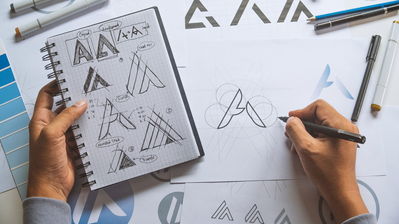
A logo is the visual centerpiece of a company’s brand identity.
Whether you’re looking for a logo design for a new business or considering a rebrand, your company’s logo design should feel fresh and relevant for a long time, and not dated a year from now.
When you set aside all the design trends and fancy fonts, at its core, a logo must:
1- Embody your brand.
2- Be instantly recognizable.
3- Be versatile.
4- Be timeless.
Everything else is optional.
A well-designed logo will help boost awareness and can improve your marketing and bottom line. A poorly designed logo, or one that has outgrown your brand, can tarnish your brand.
So, if the best logos are timeless, then are logo trends even worth considering?
Yes.
Trends invite us to think innovatively and may introduce a visual concept that will serve your business well. But, the true test of any logo design trend is whether or not it successfully communicates your brand.
One of these trends may be a perfect way to communicate your brand.
1. Playful minimalism
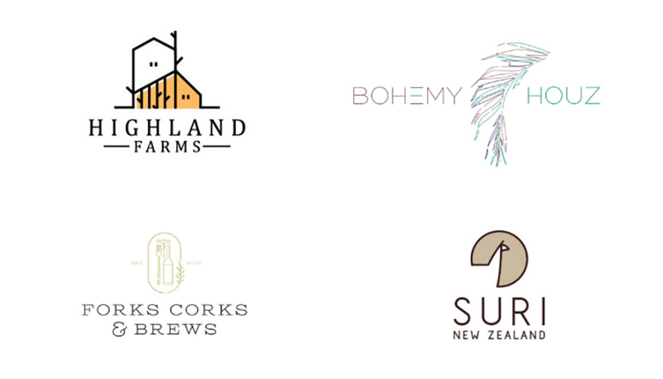 Ultra-chic minimalist logos have enjoyed a surge of popularity over the past few years.
And in a beautiful evolution, it seems designers have grown tired of taking minimalism so seriously. The modern, whimsical minimalist designs above keep the less-is-more aesthetic and execute it with a sense of warmth and humor.
All minimalism reduces its subject to just the visual essence. This makes minimalist logos very adaptable to a wide variety of backgrounds and mediums – making them very functional.
This new breed of logos enjoys all of those practical benefits while also eschewing the coldness of traditional minimalist designs. They’re more accessible – and in our opinion, more fun.
In 2020, we expect to see more logo designers exploring new ways to playfully interpret the minimalist style to suit unique brands.
Pro Tip: This trend is fun, but if your brand isn’t playful, creative, warm, or quaint (these attributes aren’t appropriate for every brand)… then it’s not the right trend for you.
2. Strong typography
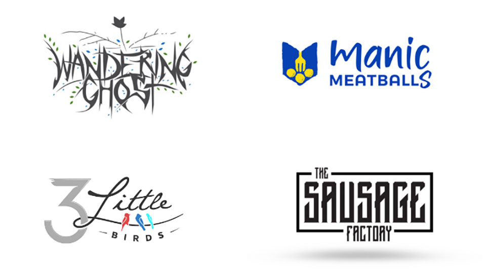 In logo design, font choices are just as important as the icons you use in the logo.
In fact, some logos (known as logotypes) are made up entirely of letters with no icon at all.
And recently, designers have grown bolder. Note the wide variety of in-your-face font choices that appear in the logos above.
But not any font will do. You can’t just plop your business name under your logo mark in a serif or sans serif font like Helvetica or Times New Roman and call it a day. Often, you must get creative with the type of treatments to personalize the design.
The beauty of this trend is its flexibility. There are so many strong fonts available to choose from – there’s bound to be a striking option that suits your unique brand.
We anticipate that designers will continue to push the envelope with creative typography in 2020.
Pro Tip: When working with a designer to get a logo, remember that typography isn’t just letters, make sure the overall look of your custom logo design supports your brand.
3. Swooshes
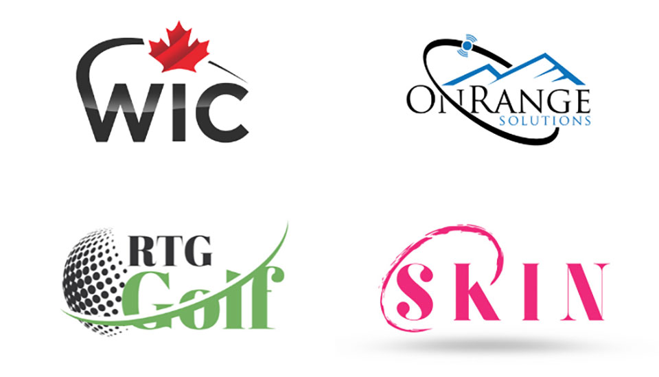 We’ll be honest – this next trend is not one of our favorites. But we seem to be in the minority because these swooshy logos are everywhere and show no sign of waning in the new year.
Curved lines can be used to communicate movement. But, adding a random curved line or ellipse to a logo has become so commonplace that it’s now landed squarely into the “overdone” category.
If you’re considering adding a swoosh to your logo, you’ve got plenty of company. But, know that that will make it harder for your brand to visually stand out.
Pro Tip: Make sure that swoosh is linked to your brand in a meaningful way before you commit to this trend. Otherwise, it’s not worth it.
4. Line art
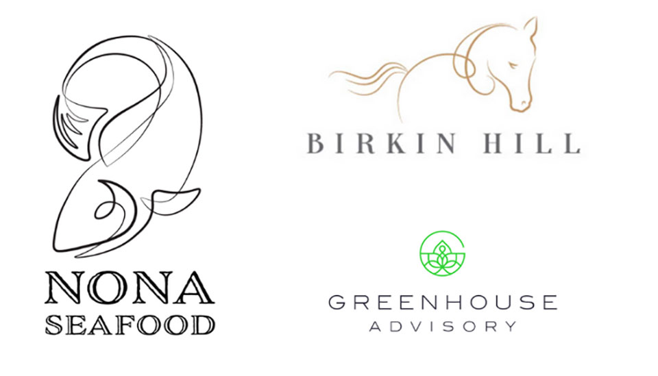 Line art is a remarkably versatile, timeless form. These traits automatically make line art a strong option for a logo.
From repurposing retro pin-striping technique to create a memorable fish, to clean geometric line drawings, to suggestive gesture logos (like the horse above), we’ve seen designers ramping up their creativity and reinterpreting what a line art logo can be.
We think this is only the beginning.
In any age, art finds a balance.
This trend is refreshing, elegant, and flexible. It’s also beautiful.
Line art logos can be rendered on virtually any background. And, with the nearly endless array of styles in which they can be executed, you’re sure to find one to match your brand’s tone.
Pro Tip: Request lighter and heavier line weight versions of your logo in your final files. The heavier line weight version will be easier to see on busier backgrounds.
What’s Next?
When starting a new business or rebranding, it’s natural to want to prove yourself. And, it can be tempting to follow a popular trend simply because it makes your logo looks like other logos – giving it credibility of a sort.
But favoring trends over your true brand identity will only hurt your business in the long run. So, always put your brand first and work with an experienced designer to get a custom logo that fully reflects your unique brand.